
源码介绍
简约的个人发布页HTML源码,简洁美观,第一个按钮带有颤动特效,源码体积比较小,单页HTML,很适合做个人引导页或者个人地址发布页
源码由HTML+CSS+JS组成,记事本打开源码文件可以进行内容文字之类的修改,双击html文件可以本地运行效果,也可以上传到服务器里面,更多好看的特效代码可以搜索QQ沐编程,觉得有帮助的话可以CTRL+D收藏一下本站
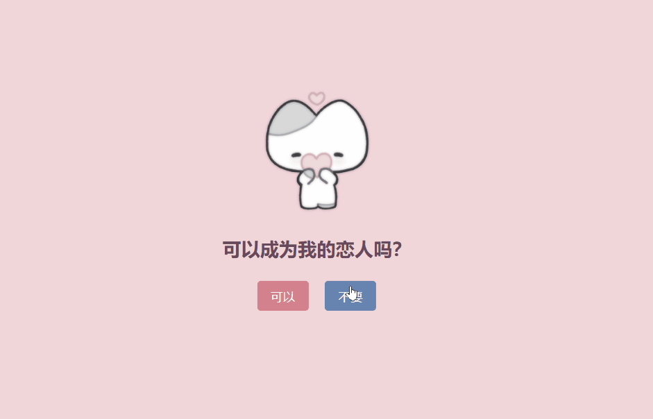
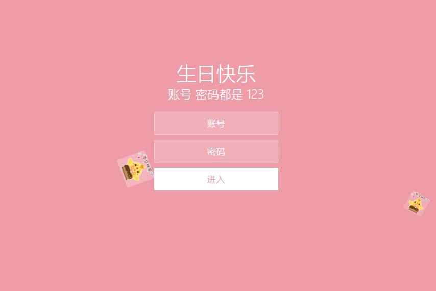
效果截图
![图片[1]-简约的个人发布页HTML源码-QQ沐编程](https://www.qqmu.com/wp-content/uploads/2025/02/gerendizhifabu.jpg)
源码如下
<!DOCTYPE html>
<html>
<head>
<meta charset="utf-8" />
<title>个人发布页</title>
<meta name="renderer" content="webkit" />
<meta http-equiv="X-UA-Compatible" content="IE=edge">
<meta name="viewport" content="width=device-width,initial-scale=1,minimum-scale=1,maximum-scale=1,user-scalable=no">
<link rel="shortcut icon" href="favicon.ico">
<meta name="author"content="1771245847">
<meta name="keywords" content="引导页,个人引导页,个人主页">
<meta name="description" content="个人引导页,个人引导页,个人主页">
<style>
*{margin:0;padding:0;font-family: "微软雅黑";box-sizing: border-box;}
			body{min-height:100vh;padding:140px 0;background:linear-gradient(to right, #bb313e25, #bb313e25, #d7222925, #dd4a1625, #e4761525, #f5c50025, #f0e92725, #b1ce2425, #48a93525, #03944525, #157c4f25, #176a5825, #1b556325, #1d386f25, #1d386f25, #20277825, #52266325, #8a244b25);}
			.main{max-width:1300px;max-width: 350px;margin:0 auto;display: flex;justify-content: center;align-items: center;}
			.item{flex:1;width:0;height:480px;border-radius:15px;position:relative;padding:5px 30px;}
			.item img{height:100px;width:100px;padding:10px;border:0px solid rgba(255,255,255,0.5);border-radius:15px;display:block;margin:0 auto;}
			.item h3{color:#FFF;text-align: center;font-size:24px;line-height:45px;margin-top:0px;}
			.item p{color:#FFF;line-height:25px;font-size:12px;margin-top:10px;}

			.item .btns{display:flex;flex-direction: row;align-items: center;justify-content: center;margin-top:20px;}
			.item .btns1{display:flex;flex-direction: row;align-items: center;justify-content: center;margin-top:20px;}
			.item a{text-decoration:none;display:block;width:250px;line-height:38px;text-align:center;border-radius:100px;background:#FFF;font-size:15px;font-weight:bold;cursor: pointer;}
			.item a:hover{opacity: 0.8;}
@media screen and (max-width: 730px) {
			    body{
			        padding:20px;
			    }
                .main {
                    display:block;
                }
                .item{
                    width:100%;
                    margin:0!important;
                    margin-bottom:15px!important;
                    transform: scale(1)!important;
                }
            }
.text-center {
  text-align: center;
  text-decoration: none;
}
.gonggao {
    max-width: 350px;
	margin: 0 auto;
    background-color: #ffffff;
    border-radius: 20px;
    padding: 10px;
	margin-bottom: 20px;
}
.JabiTg {
    width: 100%;
    display: block;
    height: auto;
    border-radius: 10px;
    cursor: pointer;
}
@keyframes shake_button {
    0% {
        transform: translateX(3px) rotate(1deg)
    }

    2.5% {
        transform: translateX(-3px) rotate(-1deg)
    }

    5% {
        transform: translateX(3px) rotate(1deg)
    }

    7.5% {
        transform: translateX(-3px) rotate(-1deg)
    }

    10% {
        transform: translateX(2px) rotate(1deg)
    }

    12.5% {
        transform: translateX(-2px) rotate(-1deg)
    }

    15% {
        transform: translateX(2px) rotate(1deg)
    }

    17.5% {
        transform: translateX(-2px) rotate(-1deg)
    }

    20% {
        transform: translateX(1px) rotate(1deg)
    }

    22.5% {
        transform: translateX(-1px) rotate(-1deg)
    }

    25% {
        transform: translateX(0) rotate(0deg)
    }
}
</style>
</head>
<body>
<div class="gonggao">
<a class="JabiBg" style="padding: 0px;" target="_blank" href="https://www.qqmu.com">
<img class="JabiTg" src="https://www.qqmu.com/logo.png">
</a></div>
<div class="main">
<div class="item" style="background:linear-gradient(to right, rgb(64, 153, 255), rgb(56, 114, 255));z-index:3;transform:scale(1);">
<img src="http://q1.qlogo.cn/g?b=qq&nk=817094&s=100" />
<h3>个人发布页</h3>
<h3><p style="color: #FFF;">QQ沐编程发布页</p></h3>
<div class="btns1">
<a style="color:#3875ff; animation: shake_button 3s linear 0s infinite normal none running;" href="http://www.qqmu.com" target="_self">待添加</a>
<br><br></div>
<div class="btns">
<a style="color:#3875ff;margin-left:0px;" href="http://www.qqmu.com" target="_self">待添加</a></div>
<div class="btns">
<a style="color:#3875ff;margin-left:0px;" href="https://www.qqmu.com" target="_self">QQ沐编程</a></div>
</div>
</body>
</html>
© 版权声明
本站资源来自互联网收集,仅供用于学习和交流,请勿用于商业用途。如有侵权、不妥之处,请联系站长并出示版权证明以便删除。敬请谅解!
THE END